Getty Images Creative Contributor Experience - Start Page with asset detection
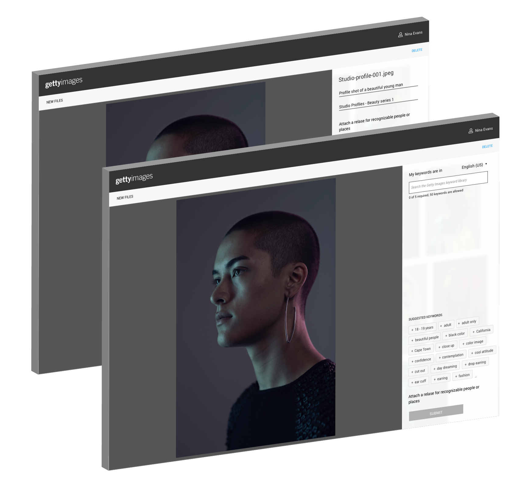
This is an example of the asset upload screen. We wanted to create a clean, intutitive interface that was easy and fun to use.

Getty Images Creative Contributor Experience - Image tagging & keywording
We decided to suggest keywords based upon a few criteria and also allow the contributor to search for keywords. The contributor selects a keyword from our suggested or search results controlled vocabulary list. This pattern has multiple benefits for Getty Images and the contributor. As an example, by utilizing a controlled vocabulary term as a keyword the contributors image is more likely to be found through search and browse. By surfacing the appropriate images to the right audience Getty Images is more likely to make sales.
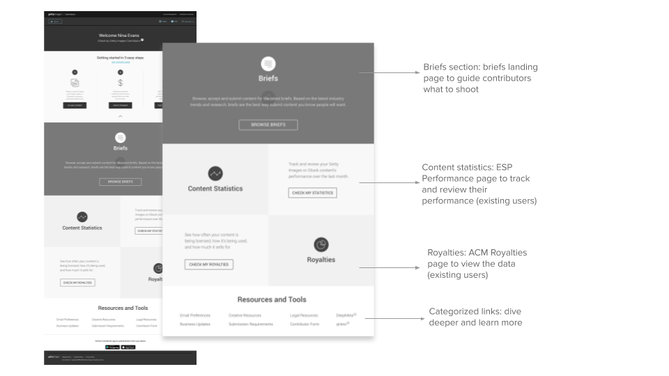
Getty Images Creative Contributor Experience - Guided on-boarding
We discovered through research and data utilized from out companion mobile app that a large segement of our contributors were not as technically savvy as previously assumed. For this reason we decided to create a guided on-boarding experience. This was intended to reduce user friction and to encourage contributors to explore advanced content like briefs.

- Date
- September, 2018
- ROLE
- Senior Designr, responsible for end to end experience, worked with a Junior Designer.
- Client
- Various internal stakeholders, Getty Images Contributors
I worked with a number of internal stakeholders including the search team, localization, project managers, product owners and research to identify areas and features within our contribution platform that we had an opportunity to improve.
After some exploration and discovery we decided as a group to re-design the experience.
We took an incremental, iterative small slice approach to improving the entire eco-system and sttod up an interface to a unique group of friendly contributors for feedback and testing.